Customer Segment Profiling App with Streamlit

Introduction
The most crucial step of any data science project is deployment. Your model or solution must be accessible to the less technical colleagues (e.g. analysts, managers) in a way that is intuitive and scalable, if you want it to be used. There’s a myriad of deployment options now, ranging from API development on cloud to simple integrations into dashboards. Yet, the one that I personally find the most intersting is deployment through a web app. Recently, it became very easy to integrate your models into a web interface using Python packages like Dash and Streamlit. In this blog, I’ll show you how you can create an app using Streamlit that profiles your customer segments that you have created (maybe by following this tutorial).
Profiling Segments
Profiling refers to exploring and understanding the segments. With profiling we attempt to explain what makes a particular segment distinguishable and interesting. While you could use a naive approach and compare the averages of segments one feature at a time, there’s a smarter way to do it. The approach that I use in my work all the time has 3 steps:
- Build a classification model for segments
- Get importance values using SHAP
- Compare the distributions of segments in the most important features
The input data needs to have the features used in clustering (plus any other that might be of interest), and a column which corresponds to the assigned clusters. You can find an example data here and a profiling notebook in my github to follow along. First, let’s write a function that’s going to profile each cluster and display the scaled feature values for comparison in a barplot. We’ll focus only on 7 most important features, because it’s easier to visually interpret. The function has 3 parts that correspond to the steps discussed above.
def profile_clusters(df_profile, categorical=None):
    #-------------------------------Classification Model-------------------------------
    X = df_profile.drop('cluster', axis=1)
    y = df_profile['cluster']

    clf = LGBMClassifier(class_weight='balanced', colsample_bytree=0.6)
    scores = cross_val_score(clf, X, y, scoring='f1_weighted', cv=5)
    print(f'F1 score is {scores.mean()}')

    # Model quality check
    if scores.mean() > 0.5:
        clf.fit(X, y)
    else:
        raise ValueError("Clusters are not distinguishable. Can't profile. ")

    #-----------------------------SHAP Importance--------------------------------------
    # Get importance
    explainer = shap.TreeExplainer(clf)
    shap_values = explainer.shap_values(X)

    # Get 7 most important features
    importance_dict = {f: 0 for f in X.columns}
    topn = 7
    topn = min(len(X.columns), topn)

    #Aggregating the absolute importance scores per feature per cluster
    for c in np.unique(df_profile['cluster']):
        shap_df = pd.DataFrame(shap_values[c], columns=X.columns)
        abs_importance = np.abs(shap_df).sum()
        for f in X.columns:
            importance_dict[f] += abs_importance[f]

    #Sorting the dictionary by importance
    importance_dict = {k: v for k, v in sorted(importance_dict.items(), key=lambda item: item[1], reverse=True)}
    important_features = [k for k, v in importance_dict.items()]
    n_important_features = [k for k, v in importance_dict.items()][:topn]

    #----------------------------Output prep--------------------------------------------
    # DATAFRAME OUTPUT - concatenate profiles of all the clusters into 1 dataframe
    for k in np.unique(df_profile['cluster']):
        if k == 0:
            profile = pd.DataFrame(columns=['cluster', 'feature', 'mean_value'], index=range(len(n_important_features)))
            profile['cluster'] = k
            profile['feature'] = n_important_features
            profile['mean_value'] = df_profile.loc[df_profile.cluster == k, n_important_features].mean().values
        else:
            profile_2 = pd.DataFrame(columns=['cluster', 'feature', 'mean_value'],
                                     index=range(len(n_important_features)))
            profile_2['cluster'] = k
            profile_2['feature'] = n_important_features
            profile_2['mean_value'] = df_profile.loc[df_profile.cluster == k, n_important_features].mean().values
            profile = pd.concat([profile, profile_2])

    profile.reset_index(drop=True, inplace=True)

    #PLOT OUTPUT
    # Scaling for plotting
    for c in X.columns:
        df_profile[c] = MinMaxScaler().fit_transform(np.array(df_profile[c]).reshape(-1, 1))

    # Plotly output
    cluster_names = [f'Cluster {k}' for k in np.unique(df_profile['cluster'])] # X values such as "Cluster 1", "Cluster 2", etc
    data = [go.Bar(name=f, x=cluster_names, y=df_profile.groupby('cluster')[f].mean()) for f in n_important_features] #a list of plotly GO objects with different Y values
    fig = go.Figure(data=data)
    # Change the bar mode
    fig.update_layout(barmode='group')

    return fig, profile, important_features
The function has 3 outputs, but we’re interested only in the Plotly figure (other 2 outputs are for further manual exploration). A few important things to note in the block of code above:
- Classifier needs to have
colsample_bytree='balanced'because some clusters might be underrepresented colsample_bytree=0.6ensures that the classiier doesn’t rely on a single feature that might perfectly explain the clusters- A CV F1 score check by
cross_val_scoreis important to ensute that our model does indeed distinguish between clusters - SHAP values can be negative as well (in comparison to
feature_importanceattribute), that’s why aggregating the absolute SHAP values is important.
Now, we can finally run the following code to get our profiles:
df = pd.read_csv('./data/ga_customers_clustered.csv')
df_profile = df.drop('fullVisitorId', axis=1)
categorical = ['channelGrouping', 'device.browser', 'device.deviceCategory', 'device.operatingSystem', 'trafficSource.medium']
#OHE if categorical data is present
if categorical:
    df_profile = pd.get_dummies(df_profile, columns=categorical)
fig, profile, important_features = profile_clusters(df_profile, categorical)

fig.show()
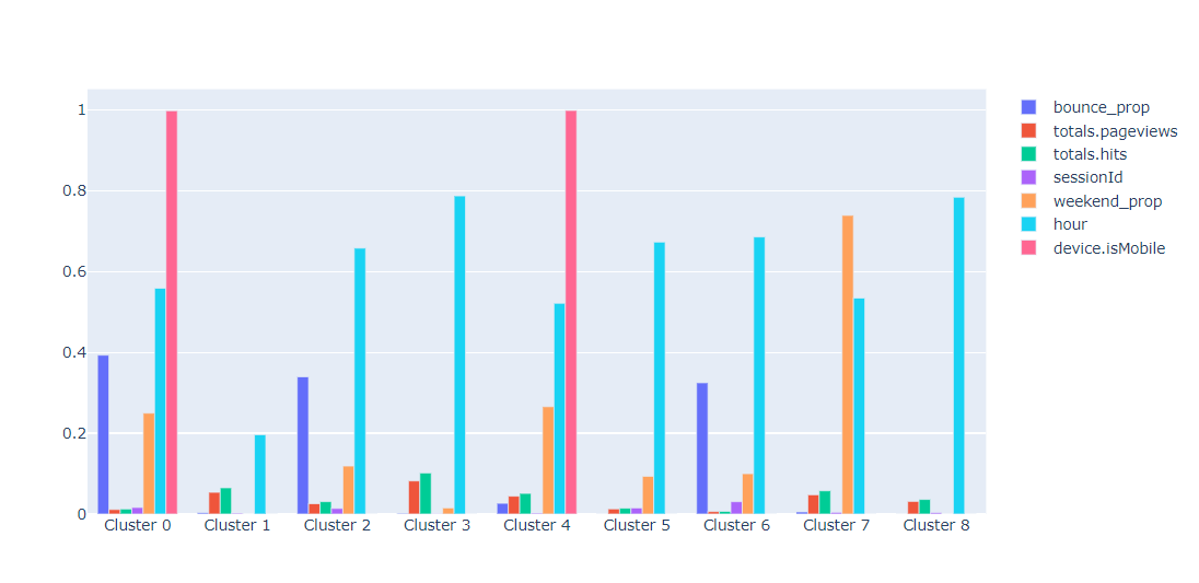
From the chart we can see that 2 of the 9 clusters created are mostly mobile. Furthermore, one of them includes users with high bounce rate while the other one has more hits and page views. Similar analysis can be done for other clusters since all of them are quite distinct. We can also look at distributions by feature using this function:
def profile_feature(df_profile, feature):
    #Checks if it's a binary
    if df_profile[feature].nunique() > 2:
        #If not binary, make Box plots
        box_data = [go.Box(y=df_profile.loc[df_profile.cluster == k, feature].values, name=f'Cluster {k}') for k in np.unique(df_profile.cluster)]
        fig = go.Figure(data=box_data)
    else:
        #If binary, make bar plot
        x =[f'Cluster {k}' for k in np.unique(df_profile.cluster)]
        y = [df_profile.loc[df_profile.cluster == k, feature].mean() for k in np.unique(df_profile.cluster)]
        fig = go.Figure([go.Bar(x=x, y=y)])
    return fig

feature = 'bounce_prop'
profile_feature(df_profile, feature)
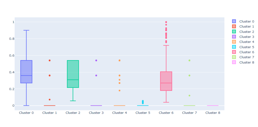
This type of profiling allows us to see that clusters 0, 2, and 6 have users who have significant proportion of bounce sessions. By changing the feature variable you can see similar plots for other attributes that interest you.
With these 2 functions ready, it’s time to make them available to the wider business by putting them into a Streamlit app.
Streamlit
Streamlit is a Python package that allows you to develop web applications without writing a single (well, almost) line of HTML and JS code. It also doesn’t use callbacks (in comparison to Dash), which makes the development even easier. Developing with Streamlit is super fast, and the results almost always look good right out-of-the-box. All of the Streamlit functions and methods that I use are very nicely documented here. So, if you have doubts on how to use any of the st methods below, check out the documentation or contact me with your question. I’ll split the code into 4 steps:
- Data upload
- Display of cluster profiles (1st function)
- Display of feature profiles (2nd function)
- Data export
Data Upload
Streamlit has a native way to upload files, which makes our job very easy. Also, before passing the data to profile_clusters functions, we first need to select the categorical variables and get rid of the ID column. All of this can be done inside the interface using in-built selectors selectbox and multiselect.
st.title('AutoCluster') #Specify title of your app
st.sidebar.markdown('## Data Import') #Streamlit also accepts markdown
uploaded_file = st.sidebar.file_uploader("Choose a CSV file", type="csv") #data uploader

if uploaded_file is not None:
    data = pd.read_csv(uploaded_file)
    st.markdown('### Data Sample')
    st.write(data.head())
    id_col = st.sidebar.selectbox('Pick your ID column', options=data.columns)
    cat_features = st.sidebar.multiselect('Pick your categorical features', options=[c for c in data.columns], default = [v for v in data.select_dtypes(exclude=[int, float]).columns.values if v != id_col])
    clusters = data['cluster']
    df_p = data.drop(id_col, axis=1)
    if cat_features:
        df_p = pd.get_dummies(df_p, columns=cat_features) #OHE the categorical features
    prof = st.checkbox('Check to profile the clusters')

else:
    st.markdown("""
    <br>
    <br>
    <br>
    <br>
    <br>
    <br>
    <h1 style="color:#26608e;"> Upload your CSV file to begin clustering </h1>
    <h3 style="color:#f68b28;"> Data Science for Marketing </h3>

    """, unsafe_allow_html=True)
In the code above, a location of file to upload is passed to the read_csv function and this becomes your data object. The if/else statements helps us to start the profiling only after a file has been uploaded which avoids unnencessary warnings and errors. Notice, that if you specify unsafe_allow_html=True to the markdown method, you can write HTML code with styling and appropriate tags. With data uploaded, we can pass it to the functions that we’ve previosuly written.
Display of Cluster Profiles
Once the data is uploaded, a user will need to check the checkbox to profile. If it’s pressed and the data is read in properly, the profiling will start.
if (prof == True) & (uploaded_file is not None):
    fig, profiles, imp_feat = profile_clusters(df_p, categorical=cat_features)
    st.markdown('<hr>', unsafe_allow_html=True)
    st.markdown(f'<h3 "> Profiles for {len(np.unique(clusters))} Clusters </h3>',
                            unsafe_allow_html=True)
    fig.update_layout(
        autosize=True,
            margin=dict(
                l=0,
                r=0,
                b=0,
                t=40,
                pad=0
            ),
        )
    st.plotly_chart(fig)

    show = st.checkbox('Show up to 20 most important features')
    if show == True:
        l = np.min([20, len(imp_feat)])
        st.write(imp_feat[:l])

elif (prof == False) & (uploaded_file is not None):
    st.markdown("""
    <br>
    <h2 style="color:#26608e;"> Data is read in. Check the box to profile </h2>

    """, unsafe_allow_html=True)
The if statement ensures that profiling will begin immediately after the data has been read in and the checkbox is checked. Figure gets passed to the plotly_chart method which takes care of displaying the figure. Also, a user gets an option to see up to 20 most important variables for further analysis off the application.
Display of Feature Profiles
Because the profile_feature function takes feature name as an input, we need to be able to select this feature in the interface. Here again I’m going to use the selectbox widget to select feature name and plotly_chart to show the output chart.
st.markdown('<hr>', unsafe_allow_html=True)
st.markdown(f'<h3 "> Features Overview </h3>',
            unsafe_allow_html=True)
feature = st.selectbox('Select a feature...', options = df_p.columns)
feat_fig = profile_feature(df_p, feature)
st.plotly_chart(feat_fig)
Notice that it’s still under the same condition as the previous block of code.
Data Export
Finally, let’s say that we want to export the profiles dataframe that we’ve created earlier. We’d need some sort of a download button which, unfortunately, is not available as native Streamlit widget as of yet. Luckily, there’s a workaround provided in this thread:
def get_table_download_link(df, filename, linkname):
    """Generates a link allowing the data in a given panda dataframe to be downloaded
    in:  dataframe
    out: href string
    """
    csv = df.to_csv(index=False)
    b64 = base64.b64encode(
        csv.encode()
    ).decode()  # some strings <-> bytes conversions necessary here
    href = f'<a href="data:file/csv;base64,{b64}" download="{filename}">{linkname}</a>'
    return href

st.subheader('Downloads')
st.write(get_table_download_link(profiles,'profiles.csv', 'Download profiles'), unsafe_allow_html=True)
Now, when you click on the link, the dataframe should be automatically downloaded as csv.
Putting It All Together
With the main functions and Streamlit elements discussed, we can put it all together. You can find the code in this repo. If you download it and run the following command in command prompt streamlit run cluster_app.py, the app should get hosted on your local device. The final interface looks as follows:
![]()