K-Prototypes - Customer Clustering with Mixed Data Types

Introduction
Customer segmentation forms a basis for most of the communication and marketing strategies. It allows companies to deliver personalised experience to their customers which is a must in today’s competetive environment. In data-driven organisations, segmentation is often informed by clustering algorithms that attempt to group similar customers according to their behaviour and other attributes. This blog will cover 2 such algorithms - K-Means and K-Prototypes. These two algorithms will be compared on their ability to group customers using both numerical and categorical features.
K-Means & K-Prototypes
K-Means is one of the most (if not the most) used clustering algorithms which is not surprising. It’s fast, has a robust implementation in sklearn, and is intuitively easy to understand. If you need a refresher on K-means, I highly recommend this video. K-Prototypes is a lesser known sibling but offers an advantage of workign with mixed data types. It measures distance between numerical features using Euclidean distance (like K-means) but also measure the distance between categorical features using the number of matching categories. It was first published by Huang (1998) and was implemented in python using this package.
Data
We’re going to cluster Google Analytics data taken from the Kaggle competition here. Since the dataset is on session (web visit) level, there needs to be done an extensive feature aggregation and engineering effort. I’m not going to include code in here but feel free to check the notebook in my github. It includes these 3 steps for pre-processing:
- Read in the dataset (includes a function to read in JSON columns)
- Filter relevant users and session
- Aggregate sessions for each customer and do feature engineering
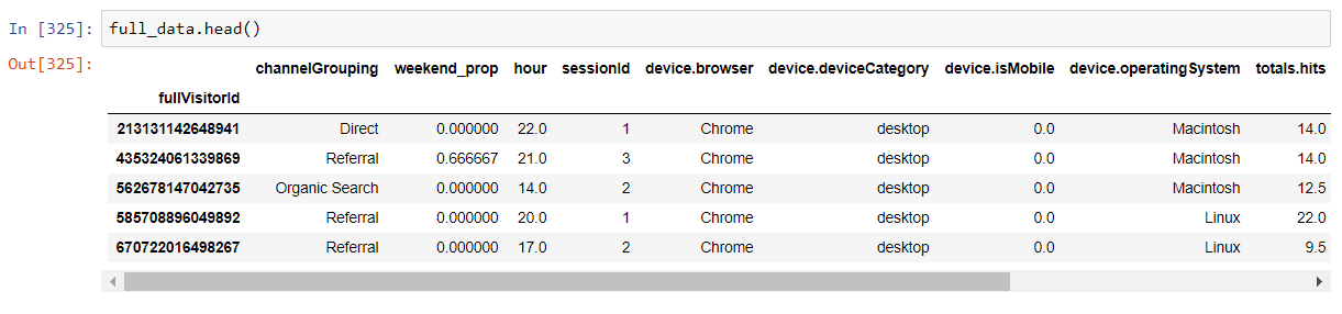
The aggregated and cleaned dataset will look like this:
Alternatively, you can download already processed data from here and continue to the next steps.
UMAP Embedding
Before going to clustering, there’s one extra step to do. One of the comparison methods will be visual, so we need a way to visualise the quality of clustering. I’ll be using Uniform Manifold Approximation and Projection for Dimension Reduction (UMAP) - a dimensionality reduction technique (like PCA or t-SNE) - to embedd the data into 2 dimensions. This will allow me to visually see the groups of customers, and how well did the clustering algorithms do the job. There are 3 steps to get the proper embeddings:
- Yeo-Johnson transform the numerical columns & One-Hot-Encode the categorical data
- Embed these two column types separately
- Combine the two by conditioning the numerical embeddings on the categorical embeddings as suggested here
#Preprocessing numerical
numerical = full_data.select_dtypes(exclude='object')

for c in numerical.columns:
    pt = PowerTransformer()
    numerical.loc[:, c] = pt.fit_transform(np.array(numerical[c]).reshape(-1, 1))

##preprocessing categorical
categorical = full_data.select_dtypes(include='object')
categorical = pd.get_dummies(categorical)

#Percentage of columns which are categorical is used as weight parameter in embeddings later
categorical_weight = len(full_data.select_dtypes(include='object').columns) / full_data.shape[1]

#Embedding numerical & categorical
fit1 = umap.UMAP(metric='l2').fit(numerical)
fit2 = umap.UMAP(metric='dice').fit(categorical)

#Augmenting the numerical embedding with categorical
intersection = umap.umap_.general_simplicial_set_intersection(fit1.graph_, fit2.graph_, weight=categorical_weight)
intersection = umap.umap_.reset_local_connectivity(intersection)
embedding = umap.umap_.simplicial_set_embedding(fit1._raw_data, intersection, fit1.n_components,
                                                fit1._initial_alpha, fit1._a, fit1._b,
                                                fit1.repulsion_strength, fit1.negative_sample_rate,
                                                200, 'random', np.random, fit1.metric,
                                                fit1._metric_kwds, False)

plt.figure(figsize=(20, 10))
plt.scatter(*embedding.T, s=2, cmap='Spectral', alpha=1.0)
plt.show()
Code above should produce the embeddings that result in this scatter plot:
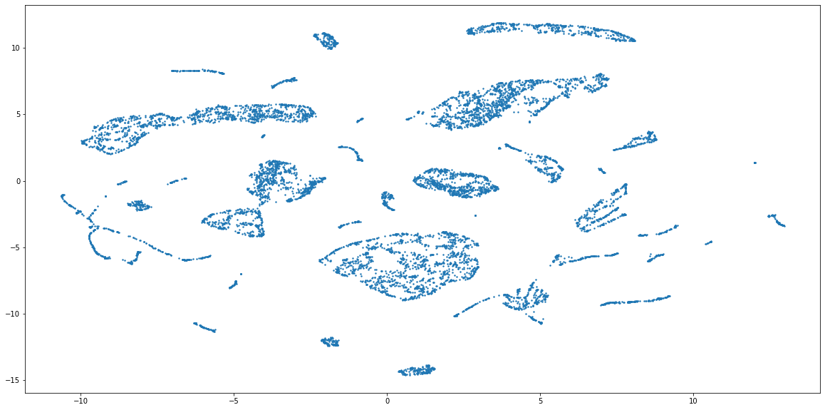 The combined embeddings seem to have about 15 distinct clusters, and a lot more smaller ones. For the sake of simplicity, I will cluster the data into 15 groups, but to find out the actual number of clusters you can use something like elbow method (see code below). Please note, that it is not given that this embedding has captured the grouping properly, because the method of combining numerical and categorical is still very experimental in UMAP. But, because this form of evaluation is used only to compare the perfomance of two clustering methods, the representations can still be useful.
Now, let’s begin actual modelling with K-means amd K-Prototypes.
K-Means
Because K-Means only works with numerical data, I’ll:
- One-Hot-Encode the categorical data
- Apply the Yeo-Johnson transformation to the data to make it more Gaussian like
- Fit K-Means with 15 clusters
#One-Hot-Encoding
data = pd.get_dummies(full_data)

#Pre-processing
for c in data.columns:
    pt = PowerTransformer()
    data.loc[:, c] = pt.fit_transform(np.array(data[c]).reshape(-1, 1))

#Actual Clustering
kmeans = KMeans(n_clusters=15).fit(data)
kmeans_labels = kmeans.labels_

#OPTIONAL: Elbow plot with inertia
#Elbow method to choose the optimal number of clusters
sse = {}
for k in tqdm(range(2, 50)):
    kmeans = KMeans(n_clusters=k, max_iter=1000).fit(data)
    sse[k] = kmeans.inertia_ # Inertia: Sum of distances of samples to their closest cluster center

fig = go.Figure(data=go.Scatter(x=list(sse.keys()), y=list(sse.values())))
fig.show()
Quite easy, right? We’ll see how well K-Means did the job later in the comparison section. Now, let’s move to K-Prototypes.
K-Prototypes
For K-Prototypes, I’ll apply the transformation to numerical data. Categorical data doesn’t need any pre-processing.
kprot_data = full_data.copy()
#Pre-processing
for c in full_data.select_dtypes(exclude='object').columns:
    pt = PowerTransformer()
    kprot_data[c] =  pt.fit_transform(np.array(kprot_data[c]).reshape(-1, 1))

categorical_columns = [0, 4, 5, 7, 11] #make sure to specify correct indices

#Actual clustering
kproto = KPrototypes(n_clusters= 15, init='Cao', n_jobs = 4)
clusters = kproto.fit_predict(kprot_data, categorical=categorical_columns)

#Prints the count of each cluster group
pd.Series(clusters).value_counts()

#OPTIONAL: Elbow plot with cost (will take a LONG time)
costs = []
n_clusters = []
clusters_assigned = []

for i in tqdm(range(2, 25)):
    try:
        kproto = KPrototypes(n_clusters= i, init='Cao', verbose=2)
        clusters = kproto.fit_predict(kprot_data, categorical=[0, 6, 7, 9, 13])
        costs.append(kproto.cost_)
        n_clusters.append(i)
        clusters_assigned.append(clusters)
    except:
        print(f"Can't cluster with {i} clusters")

fig = go.Figure(data=go.Scatter(x=n_clusters, y=costs ))
fig.show()
Visual Evaluation
Now we have two sets of cluster labels. First evaluation that I’m going to do is to color the dots of UMAP embeddings from above and see which make more sense.
K-Means
fig, ax = plt.subplots()
fig.set_size_inches((20, 10))
scatter = ax.scatter(embedding[:, 0], embedding[:, 1], s=2, c=kmeans_labels, cmap='tab20b', alpha=1.0)

# produce a legend with the unique colors from the scatter
legend1 = ax.legend(*scatter.legend_elements(num=15),
                    loc="lower left", title="Classes")
ax.add_artist(legend1)
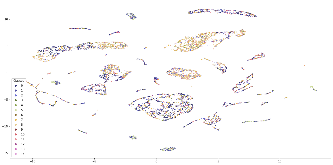 K-Means provides some structure to the data, but the classes are quite mixed. Also, the visualisation is dominated by 4-5 classes and the borders between the groups are not clearly visible.
K-Prototypes
fig, ax = plt.subplots()
fig.set_size_inches((20, 10))
scatter = ax.scatter(embedding[:, 0], embedding[:, 1], s=2, c=clusters, cmap='tab20b', alpha=1.0)

# produce a legend with the unique colors from the scatter
legend1 = ax.legend(*scatter.legend_elements(num=15),
                    loc="lower left", title="Classes")
ax.add_artist(legend1)
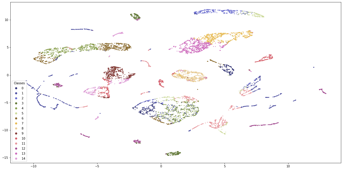 Just by visual inspection, K-Prototypes provides more distinguishable clusters. K-Means is generally dominated by 4-5 clusters whereas K-Prototypes clusters are more equally distributed with clear boundaries. Still, some clusters appear in many places along the embedding scatterplot, so either the embeddings are flawed or the clustering misses something.
Evaluation by Classification
Another comparison that I’m going to do is by treating the clusters as labels and building a classification model on top. If the clusters are of high quality, the classification model will be able to predict them with high accuracy. At the same time, the models should use a variety of features to ensure that the clusters are not too simplistic. Overall, I’ll check the following attributes:
- Distinctivness of clusters by cross-validated F1 score
- Informativness of clusters by SHAP feature importances
I will use LightGBM as my classifier because it can use categorical features and you can easily get the SHAP values for the trained models.
K-Means
#Setting the objects to category
lgbm_data = full_data.copy()
for c in lgbm_data.select_dtypes(include='object'):
    lgbm_data[c] = lgbm_data[c].astype('category')

#KMeans clusters
clf_km = LGBMClassifier(colsample_by_tree=0.8)
cv_scores_km = cross_val_score(clf_km, lgbm_data, kmeans_labels, scoring='f1_weighted')
print(f'CV F1 score for K-Means clusters is {np.mean(cv_scores_km)}')
A CV score for K-means is 0.986 which means that the customers are grouped in meaningful and distinguishable clusters. Now, let’s see the feature importances to determine if the classifier has used all the information available to it.
#Fit the model
clf_km.fit(lgbm_data, kmeans_labels)

#SHAP values
explainer_km = shap.TreeExplainer(clf_km)
shap_values_km = explainer_km.shap_values(lgbm_data)
shap.summary_plot(shap_values_km, lgbm_data, plot_type="bar", plot_size=(15, 10))
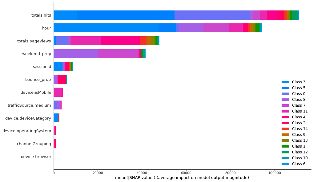
It seems like the classifier has mainly used 4 features and all the others have marginal importance. Categorical features are not really important for the classifier, so they haven’t played large role in forming the clusters. Let’s compare this to K-Prototypes clusters to see if this algorithm has used other features in grouping the customers.
K-Prototypes
Again, first we should train the model to see if clusters are predictable.
clf_kp = LGBMClassifier(colsample_by_tree=0.8)
cv_scores_kp = cross_val_score(clf_kp, lgbm_data, proto_clusters, scoring='f1_weighted')
print(f'CV F1 score for K-Prototypes clusters is {np.mean(cv_scores_kp)}')
The CV score here is 0.97 which is a bit smaller than K-Means. This means that these clusters are harder to perfectly distinguish, yet the score is high enough to conclude that K-Prototypes clusters are meaningful and distinguishable. To determine if the clusters are also distinct and informative, we need to look at SHAP values for this classifier.
clf_kp.fit(lgbm_data, proto_clusters)
explainer_kp = shap.TreeExplainer(clf_kp)
shap_values_kp = explainer_kp.shap_values(lgbm_data)
shap.summary_plot(shap_values_kp, lgbm_data, plot_type="bar", plot_size=(15, 10))
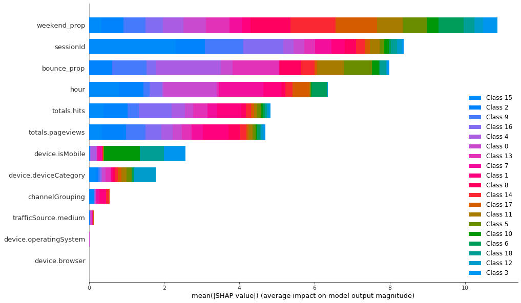 To classify the K-Prototypes clusters, LightGBM needs 10 features and 8 of them are quite important. Categorical features are still the least important, but now they have relatively higher importance than in K-Means.
Overall, classifiers for both of the clustering methods have F1 score close to 1 which means that K-Means and K-prototypes have produced clusters that are easily distinguishable. Yet, to classify the K-Prototypes correctly, LightGBM uses more features (8-9), and some of the categorical features become important. This is in contrast to K-Means which could have been almost perfectly classified using just 4-5 features. This proves that the clusters produced by K-Prototypes are more informative.
Summary
In this blog, we saw that in the presence of categorical features, K-Prototypes has produced clusters that are visually and empirically superior to the ones produced by K-Means. While both of the algorithms have separated customers into distinguishable groups, clusters created by K-Prototypes are more informative and hence can be more useful for marketers. So, next time you do clustering and encounter categorical features, ease up on that one-hot-encoding and give K-Prototypes a chance.
![]()